Insights Superadmin - Summary (Part 2)
Applications Location
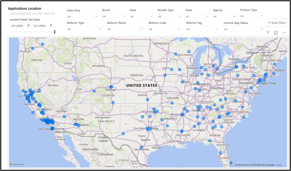
In this final tab, users will be able to locate applications based on their location. The map will show the different spots where the enrollments were created.


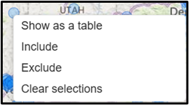
In this section, you will also be able to right-click on any of the enrollments displayed to obtain further
information.
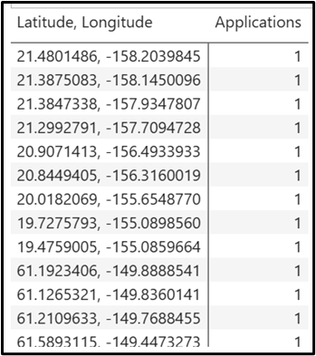
In case users want to visualize the location data in a table, the first option should be selected. The table will provide the number of Applications created in a given Latitude and Longitude.

Compliance Dashboard
This report helps users review any suspicious activity cases that may arise. The information can be sorted using the different fields from the left (Agency, Team, Agent Status, Benefit, Brand, and Account Channel). There will be a map indicating the states where the suspicious activity took place.

At the bottom, there is a table that indicates the number of agents per brand divided into Total Agents and Suspicious agents, with the respective number of Suspicious Applications.
Organic Applications Compliance Analysis
In this tab, we will also find date related to the suspicious cases divided by their Ip Address, State Code, Top Sells, Benefit, Brand, and Account Channel. As usual, there will be a list showing the number of Suspicious Cases divided by reason, a map showing the states with the lowest and highest suspicious activity and the total number of cases.

Affiliate Compliance Analysis
In this section, we will be able to carry out a review of the suspicious cases from the agencies’ perspective. Users will be able to sort the data by Affiliate (Agency), State Code, Top Sells Affiliate, Benefit, Brand, and Account Channel.

Activation Monitor
This report allows you to analyze the progress of activations, tracking their status from creation through approval or rejection. The chart below displays the number of activations in each status: Requested, Pending, Confirmed, and Cancelled.
The main page also includes a table showing the number of Pending Activations by Account Channel, broken down into Safelink website (Online Web), CSR Vault, Quest application (Grassroots Quest), and Retail store (Retail Web). Additionally, another table presents the Pending Activations by Brand, where the data is organized according to each vendor.

Below, users will find two additional tables displaying the Activation Status by Account Channel and Activation Status by Brand. As shown in the image, the report organizes the data on a daily basis, presenting the number of enrollments that reached a Pending, Confirmed, or Cancelled status. As indicated by their titles, the first table breaks down the data by account channel, while the second table groups the information by brand.

By making a right click on any of the values, a menu will be displayed where the Drill through option will be presented. This option allows users to review in detail the data related to each enrollment number that falls under the category selected.

After selecting this option, users will see a table that, apart from the enrollment number, it will present the different creation dates, the activation status and the state, among others.

Agent Onboarding Conversion Rates
In this report, users will be able to check the different actions taken by the applicants in each stage of the enrollment process. As the image below shows, each stage will be divided into the different steps that the applicant may follow.

On the right side of the report, there will be two columns. The first column, named Volume (Total), indicates the number of applicants that reached the corresponding stage. The second column, Rel %, provides the percentage of applicants that fell under that step.

In the example above, there are two distinct stages, each displayed with a white background. Since every stage includes all the steps involved in the process, their percentage completion is always shown as 100%. As for the individual steps within each stage:
- Yellow background indicates incomplete steps (also known as abandonment).
- Red background highlights steps where validation or enrollment issues occurred.
- Green background represents steps that the applicant completed successfully.
This color-coding helps quickly identify where applicants may be facing issues or where they’ve progressed without problems.
At the bottom of the report, there will be a table that will count agents depending on the number of applications Enrolled (1, 5 or 10) in the last 30 days.

Plan Change Dashboard
This report enables users to see the most common plan changes that customers request.

The table on the left displays information about plan changes. The first column lists the New Plan Description, while the second column shows the Previous Plan Description. The Quantity column indicates the number of customers who requested a change to the new plan, and the % column reflects the percentage that these requests represent in relation to the total plan changes.
The pie charts from the right will divide the plan change information by Brand, State, as well as the Previous and New Plan.
By scrolling down, users will find additional details about the plan changes, along with a graphic that provides visual support for easier interpretation.

Daily DeEnrolled Applications
This report provides a table of the DeEnrolled applications for the time range selected. After selecting the corresponding dates and selecting the benefit(s), the View Report button should be clicked for the information to be displayed. Apart from the Enrollment Number, the report will show the Benefit and Enrollment Type, the State where the application was created, the Enrollment Channel, and the different Dates related to the enrollment process.

By scrolling to the right, there will be additional information, such as the De Enroll Reason for users to know why the account was cancelled.

